Advanced Art Assignment #3
Still Life Project. This assignment is Part 2 of a two part two still life painting series.
Still life #2 will be done in acrylics with a more modern approach. You will research and study the various still life paintings by the "Father of Modern Art," Paul Cezanne, and paint from life in the Cezanne style. . Upload to this website at least three WIP (Work In Progress) photos to document your progress and share your process through weekly reflection journal entries. Once your painting is completed, upload a final image of the work with a detailed written artist's statement. Grade using the 5 C's rubric.
Click HERE for complete description of assignment #3.
Requirements:
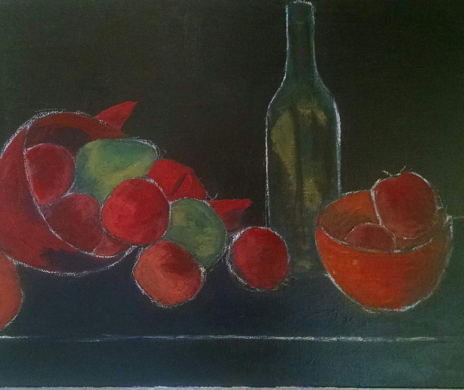
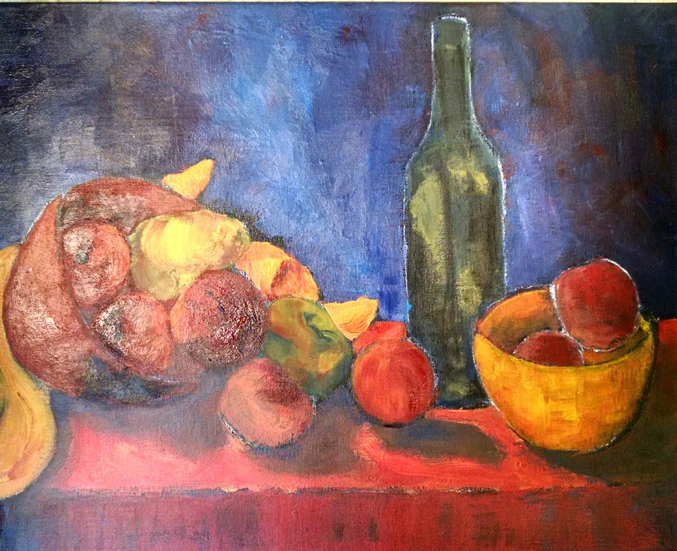
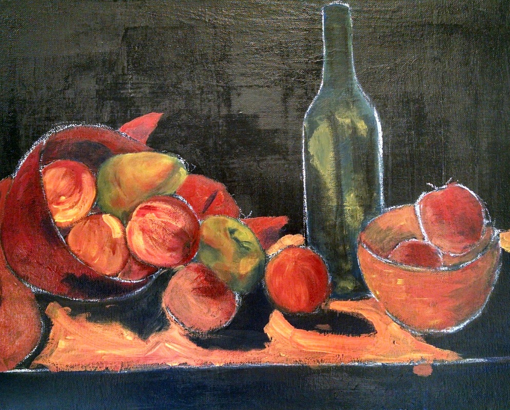
3 (or more) WIP images
Finished painting image
Artist Statement
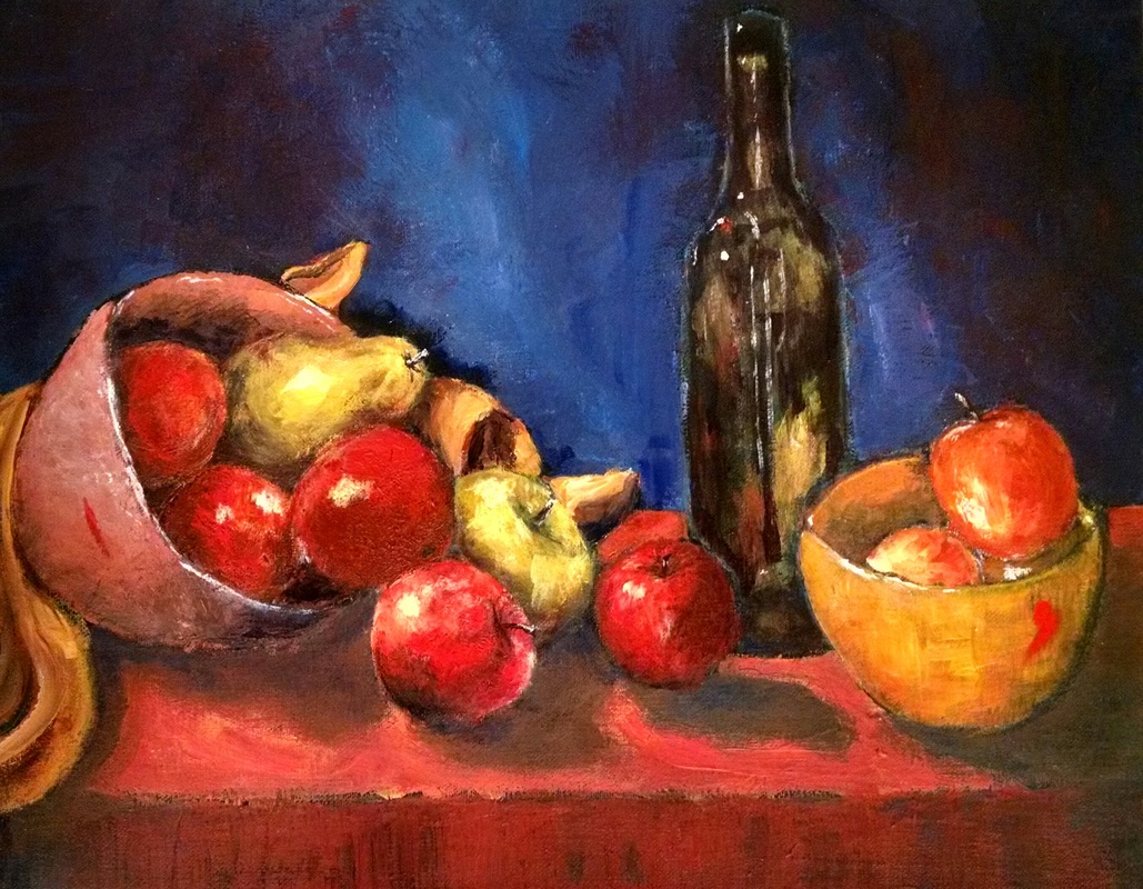
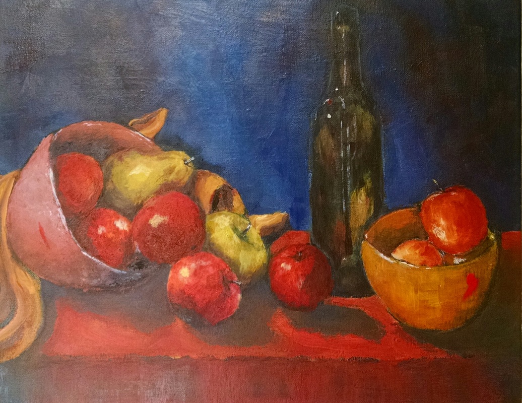
Fruits and Olive Oil
Brianna Ahlmark
Acrylic on canvas
20x16
This painting was my bull. It was very hard to get through initially, as I became overwhelmed with a style I was not used to physically mastering with my stroke styles. I started with a basic under-painting over top of the black canvas, outlining the edges in chalk so that I could leave the black outlines of the fruits remaining. After painting the table, I saw that most of my colors were not varying enough in color, and decided that- along with my blue/purple background- I would change the colors of my bowls, adding more harmony to the piece. Then, when adding more color and dimension to my apples, I ran into trouble. I could not seem to find the right shades to lighten certain areas without painting pink. It was in these areas that I learned more about color and how to manipulate it to my advantage. The pear was also difficult in terms of creating the right dimension, and this was one of my last elements to be finished. The blues, greens, and purples created a contrast sitting next to the reds in the apples. My struggle in adding dimension here, also turned out to be a blessing when arriving at my focal point. As it turned, the many times I failed in adding color became the texture I enjoyed so much on a select few apples. Before turning the lights on, the bottle was the last thing left to complete- this was actually supposed to be a wine bottle, but after a mistaken stroke turned into a magnifying light source, I liked it as an olive oil bottle. The two cadmium red strokes on either sides of the painting are intentional, though. That red was my favorite to use throughout this piece, and I loved its vibrancy so much that I felt it could use its own space. So with a smudge of my finger on both bowls, I think the cadmium red adds something to look at. When I turned the lights on, everything came together, and I erased the chalk outline to reveal the final subject.
|
|