Advanced Art Assignment #1:
Create a painting of any subject of your choice from digitally manipulated image references. Explore various methods of digital media manipulation to effectively solve artistic problems and create a pleasing composition and a painterly approach to your work of art. Upload to this website at least three WIP (Work In Progress) photos to document your progress and share your process through weekly reflection journal entries. Once your painting is completed, upload a final image of the work with a detailed written artist's statement. Grade using the 5 C's rubric.
Click HERE for complete description of assignment #1.
Requirements:
3 (or more) WIP images
Finished painting image
Artist Statement

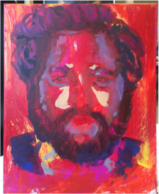
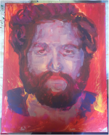
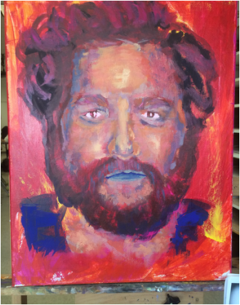
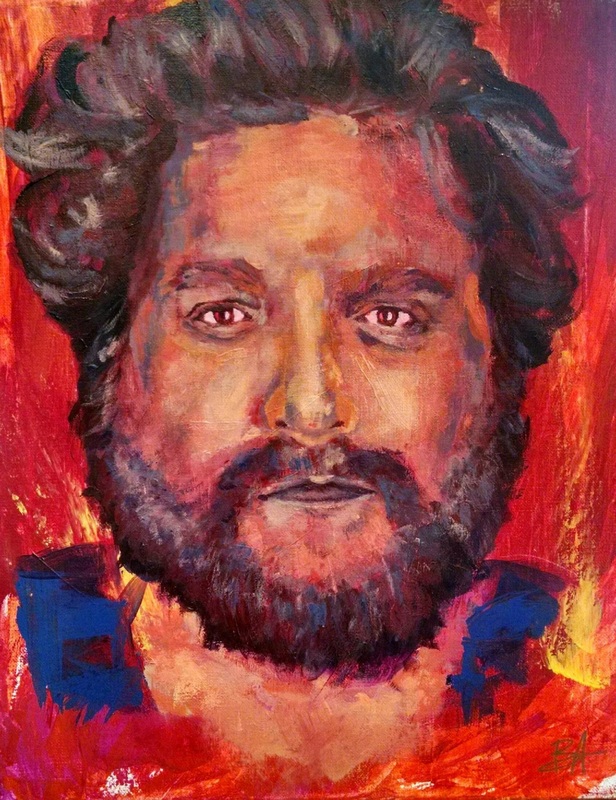
Zach Galafianakis in Reds and Blues (Passion)
Brianna Ahlmark
acrylic
16x20
I worked around a concept of human portrait, and abstractly mixed it with the idea of color value. My goal was to explore color in a new way, where the realistic element of color is lost, and yet the values stay true. I worked up to values in the face in cool color schemes that I eventually brought to light with warmer tones. The background is also a very important element to the composition, where i wanted to create a sense of passion and strong emotion- keeping strong strokes with bright yellows and oranges. Galafianakis is a very strong personality, having come from darker times and now living in a bold and brighter surrounding. Wanting to emulate this, I used a lot of dry brush strokes to keep layers of the darker underpainting dancing through. I also wanted the outer areas of the portrait to remain relatively abstract, while keeping the most central part of the face (eyes, lips, nose) more clear in their strokes. The detail there makes a stark contrast with bold, blue,and hard strokes that stand out at the shoulders of the painting. Another idea kept in mind throughout my process related to color and its relation to mood. I want to create images that are in surroundings/settings I want to enter, or that I am intrigued by. The subtle light captured in the portrait as well as the passionate, warm background makes this "setting" a place I want to be. If I were to re-name this piece, I would title it "Passion."
I created the painting using a restored canvas, adding subtle texture to the surface, and began with my basic background strokes in acrylics. I used folded manila paper almost like a squeegee to get my initial strokes in...starting with reds, and brightened up from there with highlights in hot pinks, oranges, and yellows. I added these colors in on the four sides of the canvas as well. My next step was to outline the basic facial structures, where began and continued to build upon with very abstract strokes (something I am not familiar with). Getting closer to the upper layers of the painting, I ran into a wall: value. I had not fully understood the bounds of color and value until I completed this painting. I took chances and learned my most important lesson thus far- being that I never have to get the colors right, just the values. This gave me a lot more freedom as I completed the piece and allowed myself to creep slowly outside of my comfort zone with color. Each stroke of color became crucial and nerve-racking, but they were right. My use of color became my most successful aspect in this project, because I made more progress in my own abilities creative expression than ever in a long time. I am proud to see the varying colors playing with each other throughout the painting, and I learn more about my intentions behind the painting each time I analyze it. Human form is something I want to continue exploring, along with color and expression of value.
